sam lindsay
versatile designer with expertise in UX & graphic design
I created the type lockup and animations for J.Jill's 12 Days of Gifting campaign.
These assets were used in various forms on the site, social media, and email communications.
J.Jill
Redesigning site product category headers to reflect a more modern online shopping experience.
TIMELINE: 2 weeks
TEAM: Just me!
MY ROLE: General research and design concepting
TOOLS: Photoshop, Canva
The Challenge
J.Jill is a women's clothing retailer offering in-store and online shopping experiences. As an in-house designer, I observed that we were investing a significant amount of time in designing product category headers with uncertain benefits from the customer's perspective.
Each month, there were about 30 full-width banners designed in a process involving creation of initial designs, 2-3 reviews with revisions, and release to the development team after intensive image extension work. Considering the heavy lift involved in this process, I took the initiative to investigate more deeply and determine if there was a better solution from a user experience and efficiency angle.
.jpg)
Overview of competitive analysis comparing J.Jill's category header with approaches from other similar brands
The Solution
After conducting best practices and competitor research, I proposed a new design approach to category headers to improve the site and optimize our internal workflow.


Simplify and minimize space taken up by header
Support the user in locating desired products with subcategory links
Use clear & concise titles and sub-copy

The Journey
I first conducted research on general best practices for category headers on e-commerce sites, which yielded the following essential points:

Include easily accessible subcategory links in headers for categories that encompass a wide range of products
-
Increases discoverability of subcategories
-
Facilitates easy navigation to specific product groups
-
Avoids product choice overload

Use clear, concise copy and imagery
-
Include titles and descriptions that match expectations
-
Utilize simple, generic images representing the entire category
-
Don't let the header overpower the page

To complement these ideas, I also researched how competitor brands designed and structured their category banners.


The Final Product
I ultimately developed two concepts for an updated approach to category headers informed by design principles and research on other brands. Each is outlined below alongside principles that informed different aspects of the design.
Concept A
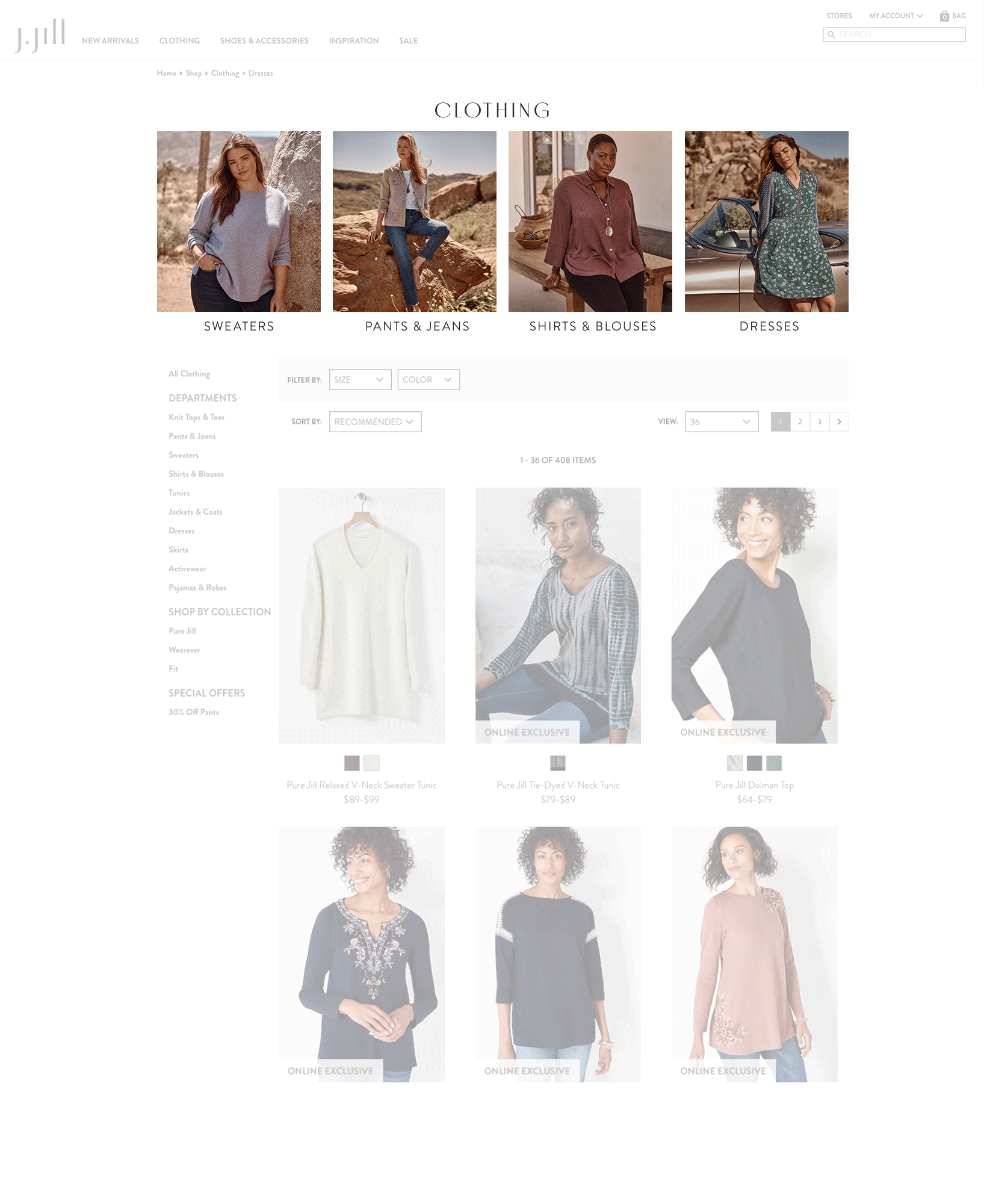
Support the user in locating desired products
For larger categories like clothing and accessories, include subcategory image links so the user can easily drill down to focus on a specific set of products.


Simplify and minimize space taken up by header
For specialized sorts, include a brief inspirational moment so the user gets a sense of the collection and is inspired to browse products.

Use clear & concise titles and sub-copy
Simplify and minimize space taken up by header
For smaller self-explanatory product categories and sale sorts, eliminate the banner in favor of a simple title so the user knows where they are but shoppable products are the focus of the page.


Concept B
Support the user in locating desired products
For larger categories, include one inspirational image with a clear title and subcategory links below so the user can easily drill down to focus on a specific set of products.

Use clear & concise titles and sub-copy
Simplify and minimize space taken up by header
For specialized sorts, include a brief inspirational moment so the user gets a sense of the collection and is inspired to browse products. In this version I added a description so the user can learn more before browsing and the page will be more likely to come up in searches.

Use clear & concise titles and sub-copy
Simplify and minimize space taken up by header
For smaller self-explanatory product categories and sale sorts, eliminate the banner in favor of a simple title so the user knows where they are but shoppable products are the focus of the page. Again, in this version I included a description to boost search and left-aligned the titles to maintain consistency.

