sam lindsay
versatile designer with expertise in UX & graphic design
I created the type lockup and animations for J.Jill's 12 Days of Gifting campaign.
These assets were used in various forms on the site, social media, and email communications.
Boston Children's Hospital X Bentley HFID
Redesigning the Digital Health section of the Boston Children's Hospital site to more effectively promote digital health offerings
TIMELINE: 9 weeks
TEAM: 3 graduate students in the Bentley HFID Master's Program; HF770: Prototyping and Interaction Design
MY ROLE: Managed the Figma prototype from start to finish, supported research and client presentation design
TOOLS: Figma, Miro
The Challenge
Boston Children's Hospital is a leading provider of pediatric healthcare services. For this sponsored project, representatives presented our class in the Bentley HFID Master's Program with the challenge of redesigning the Digital Health portion of the hospital's site to make it easier for patient families to locate and understand these offerings.
The Solution
Our team created an updated mobile-first design that showcases the hospital's offerings in a more user-friendly format. This solution incorporates changes to site information architecture, layout, and copy while maintaining brand standards.


Highlighting the benefits of Boston Children's Hospital digital offerings
Making offerings easy to find and understand
Incorporating clear & concise copy
Maintaining brand consistency & site standards


The Journey
First, we used tree testing and card sorting to inform updates to the site information architecture.
Q1: What's the best way to connect Digital Health to the BCH homepage?
In our tree test, Digital Health products & offerings were most often placed under Digital Health (52 times) or under Patients & Families (38 times) in the Boston Children's Hospital main site menu.

Original

New
Q2: How should digital health offerings be organized and named?
On the current site, there are nine different digital health products and services. We conducted a card sorting test with 13 participants to determine how best to organize and name these services.

Original

New
We leveraged the study findings to create an initial wireframe that included the entry point to Digital Health from the Boston Children's Hospital homepage menu, a new Digital Health homepage, and a Virtual Visits subpage.
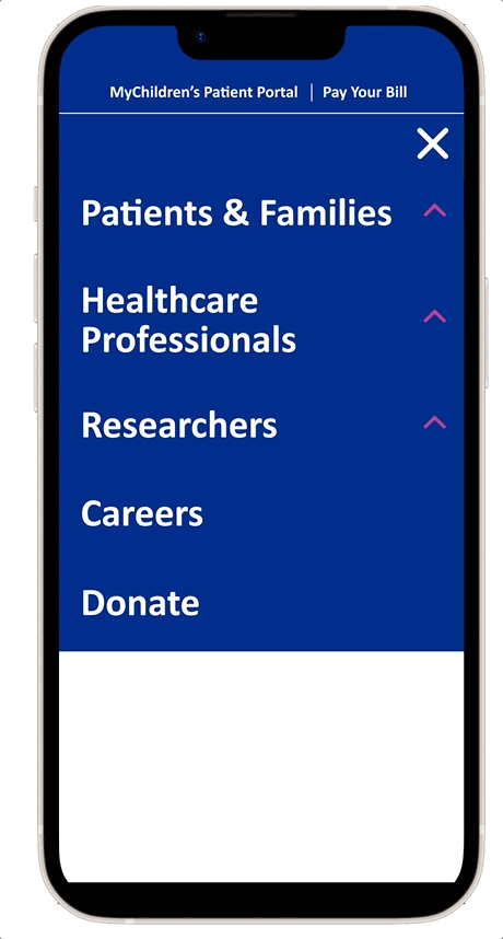
Main Menu

Digital Healthcare Homepage


Virtual Visits Subpage


After we created this initial prototype, we had the opportunity to ask questions and conduct usability testing with representatives from Boston Children's Hospital to refine the design.
There were several changes to our proposed information architecture that arose. The main updates were changing "In-Person Care" to "In-Hospital Care" and adding a "Related Programs & Services" category to host Voice Transcription and the Digital Health Accelerator.
V1

V2
We updated our wireframes to reflect these IA changes as well as several other modifications based on sponsor feedback.
Digital Healthcare Homepage


Virtual Visits Subpage

We conducted unmoderated remote usability testing with our prototype and gathered several recommendations for updates based on the results.
Sample Recommendations
Remove extra CTAs from the Digital Healthcare Virtual Visits card to reduce choice overload and support progressive disclosure of information.
Many users clicked “Schedule a Virtual Visit” to learn more about Virtual Visits and Participating Programs (rather than clicking “More about Virtual Visits”).

Update the “I Have a Virtual Visit” menu item to “Preparing for your Virtual Visit” for clarity.
Some users clicked menu items other than "I Have a Virtual Visit" to locate tips on how to have a successful virtual visit.

After this round of usability testing, we translated our designs into high fidelity utilizing Boston Children's Hospital fonts, colors, and styles.

Main Menu
Digital Healthcare Homepage


Virtual Visits Subpage


The Final Product

Proposed Information Architecture - Final
The final proposed information architecture incorporates menu structures for Virtual Visits and Voice Transcription subpages that could be used as templates for additional product pages.
The highlights of the design are described below, structured based on the high-level goals of the Boston Children's Hospital sponsor team.
Make Offerings
Easy to Find &
Understand
There is a user-friendly path from the main site menu to the Digital Healthcare homepage.
"Finding the information seemed very intuitive"
- Test Participant
"Just was easy to click through didn’t have to think!”
- Test Participant

"Virtual Care", "In-Hospital Care" and "Related Programs & Services" categories are accurately represented with Boston Children’s marketing-approved icons and proposed new icons.
Products and services are categorized in a user-friendly manner according to information architecture research findings.
Highlight
Digital Products
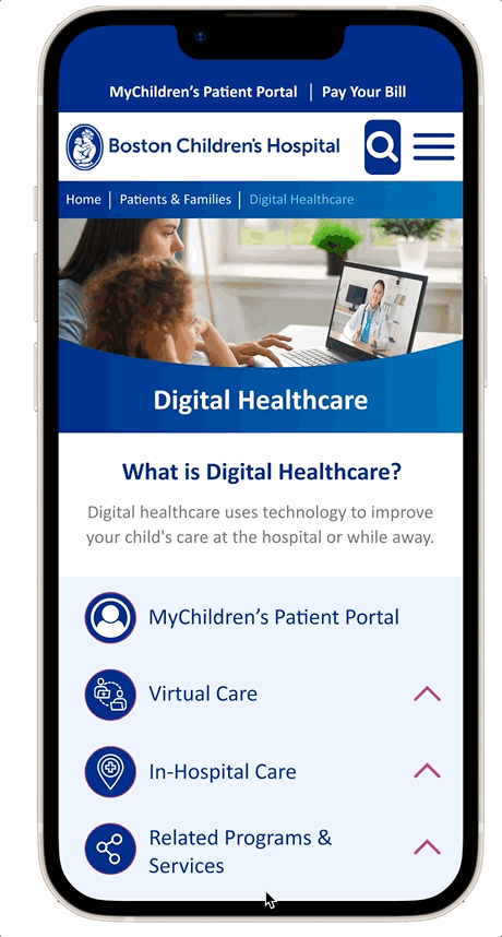
A straightforward card format with representative imagery, concise bullet points, and a single actionable CTA displays offerings with subpages on the homepage.

Key features of In-Hospital Care offerings without subpages are highlighted with clear bullet points.
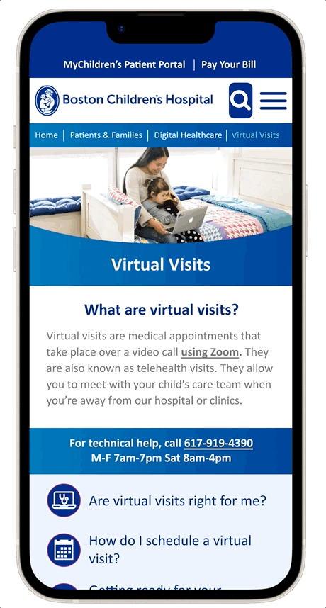
On the Virtual Visits page, a subpage menu with corresponding icons helps highlight important information and make page contents easy to navigate.
More direct language is used for the scheduling CTA under "How Do I Schedule a Virtual Visit" to facilitate engagement.

Detailed “Tips” section is replaced with a CTA link to a dedicated page to clarify location of important information.
"I did a lot of scrolling trying to find the best related link to get me the info I was looking for."
- Test Participant
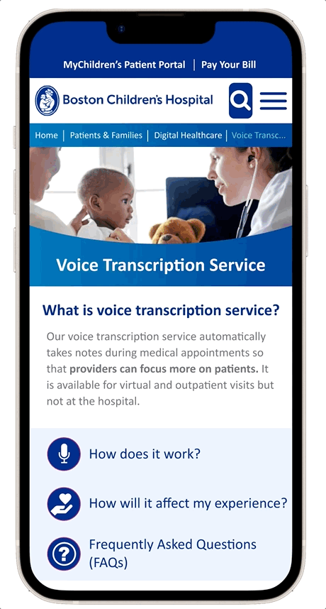
The new Voice Transcription subpage replicates the Virtual Visits subpage pattern to effectively highlight features and explain offerings in a consistent format.
Use Clear,
Concise Copy
Descriptive copy is integrated as needed while simplifying language and reducing sentence length. The Flesch Reading Ease Score was improved across all pages (Grammarly, 2022).
The Flesch Reading Ease Score measures on a scale of 1 - 100 the readability of text (100 being most easy to read and 0 being most difficult). It is based on the average length of words and sentences (Grammarly, 2020).

Follow Brand
Guidelines
Standard Boston Children’s styles, fonts, and colors are utilized for consistency across pages.


Digital Healthcare Hero photo is updated to convey more engagement between patient, parent, and provider. Also chose a brighter photo treatment to add needed contrast to the blue color scheme.


Subpage hero photos are updated to better represent offerings while maintaining consistent look and feel.